Overview
Building histograms in Excel requires a bit of work. Here are the basic steps:
- Build the frequency table.
- Build a bar plot (what Excel calls a "column graph").
- Reformat it into a proper histogram.
- Add labels and caption.
Build the frequency table
If you have the "analysis toolpak" available in your installation of Excel, you can use the "histogram" function to build the frequency table. Be aware, however, that this function, despite its name, does not actually build a histogram. It just provides the frequency table.
Here we assume that you do not have the "analysis toolpak" available. We take as an example the data set, "PHXSummTemps.xslx," which comes from NASA's Goddard Institute for Space Studies. I'm using Excel 2011 for Mac. Since Microsoft doesn't seem overly interested in standardization, the solutions here may not precisely match the solution on your implementation. But they will be close.
Download and open the the data frame in whatever version of Excel you have. The first column B through E are mean monthly temperatures in Phoenix, AZ, for June through September, respectively, for the year listed in column A. Our goal is to produce a histogram of the June data.
1. First, determine the range of the data. (See Fig. 1.) At the bottom of column B (i.e., cell B127), type "=min(B2:B126)" and hit "return" or "enter." (The range specification, "B2:B126" refers to all the cells between B2 and B126, inclusive of the ends.) Below that, in cell B128, type "=max(B2:B126)." Now you have the max and min values for the June data.

Fig. 1. Calculate the data range. Note: Min and max values have been calculated already for the other months.
2. Determine range and bin widths. The minimum value for June is 28.3 degrees C and the maximum is 35.4 degrees C. For the histogram, we need between 5 and 15 bars, so we choose bar widths to be 1 degree C. This gives our histogram 8 bars.
3. Construct the frequency table and fill in range and width data. At the top of the frame, in cells G1 through J1, type "Range," "Low," "High," and "Freq," respectively. Fill in the bar ranges, minimum and maximum values as shown in Fig. 2.

Fig. 2. Start of the frequency table with range and bar width data entered.
3. Calculate the frequency (count) of values in the first bin. In cell J2, type precisely what is shown in Fig. 3. This calls the function "COUNTIFS," which counts the frequency of values in the range specified that satisfy two criteria. In this case, the range is cells B2:B126, criterion 1 is "greater than 28.0" and criterion 2 is "less than or equal to 29.0." Be very careful to place the quotation marks and "&" sign in precisely the way shown or you will get an error. Once this is typed in, hit return and the number '2' will appear in cell J2.

Fig. 3. Using the function COUNTIFS to count the frequency of numbers in the first bin. This call will return the number '2.'
4. Complete the calculations for the rest of the frequency table. This simply requires copying the contents of cell J2 and pasting it into cells J3:J9 (or simply dragging the lower right-hand corner down to J9). See Fig. 4.

Fig. 4. Completion of the frequency table.
Build the bar plot
Now we wish to plot the frequencies as a function of temperature for June.
1. Highlight the frequency data and insert what Excel calls a "clustered column graph". Scientists refer to this as a bar plot. See Figs. 5 and 6.

Fig. 5. Highlight frequency data and insert "clustered column" graph or bar plot.

Fig. 6. The unformatted bar plot will appear.
2. Add proper bin ranges and delete the legend. Since we only plot 1 series of data, there is no need for a legend. Click on it ("Series1") and delete. Then click on any of the bars. All bars will be selected. Right click (or control-click) on a bar and choose "Select Data" from the pop-up menu (Fig. 7). A dialogue box called "Select Data Sources" will appear. Find "Category (X) axis labels" and then click the incomprehensible icon next to the entry bar. The dialogue box will window-shade up. Highlight the data in the "Range" column. The dialogue box should reappear with "Sheet1!$G$2:$G$9" in the entry box (Fig. 8). Click "OK."

Fig. 7. Right-click on the data and choose "Select Data..."
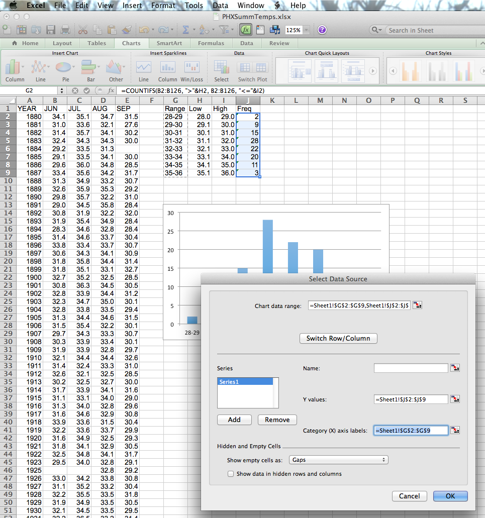
Fig. 8. Find "Category (X) axis labels" in the dialogue box.
Reformat into a proper histogram
Now we need to eliminate the space between bars since the horizontal axis represents a continuous variable, not a discrete one.
1. Right-click on a data bar as above. Then choose "Format Data Series" at the bottom of the pop-up menu (Fig. 7).
2. In the dialogue box that pops up, choose "Options" and then set "Gap Width" equal to 0. I find that this dialogue box varies in style a great deal between Mac and Windows versions and even on different versions of the software for the same platform. So you may have to look around a bit.
Add labels and caption
Finally, add axis labels (in professional style, with variable name followed by units in parentheses) and then a caption. In scientific communication, a title above the figure is not a caption. Normally, you would copy the graph out of Excel, paste into Word (if you use that) and then write a detailed caption underneath. Figure 9 shows the completed figure without the caption.
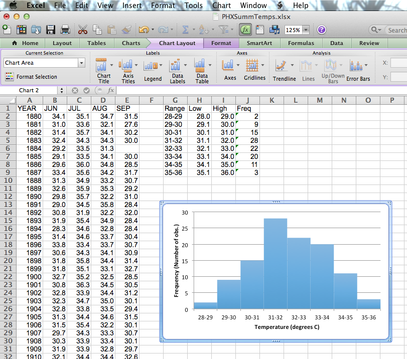
Fig. 9. Complete figure before the caption is added.
A note to the weary
Although Excel has many virtues, it is often not the best tool for for statistical analysis. As you can now see, constructing simple things like a histogram is quite laborious (even if you have the Analysis Toolpak). That's because Excel is designed primarily for business application, and business communication has a different standard than scientific communication does. There are excellent tools for scientific graphing and analysis which are much more efficient. For example, a free package called R makes histograms very easily. For example, to make the histogram we just did with R, you load the data (by writing 2 simple commands) and then type
hist(JUN, xlab='Temperature (degrees C)", ylab="Frequency (Number of obs.)").